Product pages aren’t just simple website pages. They’re pages that help convince visitors to make a purchase. Unlike home pages, people don’t skip on them, but they go directly to product pages instead.
In this blog, I’ll tackle what makes them important and how they help improve conversion rates. I’ll also list useful tips to better optimize the pages to increase your store’s conversion and growth opportunities.
What Are Product Pages?
Product pages are website pages about products and their information, including specifications, features, and some information about the brands and manufacturers. These pages usually display information in text but may also include other elements like videos and demos to showcase facts and improve conversion rates.
Product pages are used to help visitors and shoppers make decisions about whether they’ll buy or not. Since this is their main purpose, these pages must have good call-to-action (CTA) elements and detailed information.
Aside from this, one can consider a product page as a micro-site. One product page may contain more subpages that contain more information related to the product. For example, they may contain information about how to use and tips for using the product, how it was made, and the like.
Improve Conversion Rates With Optimized Product Pages
Based on a study by CM Commerce, of the 2,687 stores surveyed, the average product page conversion rate is only 7.91%. This shows that there’s a great need to optimize product pages more to improve this rate.
Product pages influence a visitor’s potential purchase decisions. This is why it’s important to nail and optimize product pages to increase an eCommerce store’s conversion rate. With higher conversion rates, there’s more chance of getting sales and revenue.
Tips To Improve Conversion Rates
Your conversion rate from qualified traffic should be about at least two and a half percent. This means that for every 100 visitors your store gets, 2 ½ of them should buy.
If your store and product pages aren’t converting much, here are some helpful tips on how to improve conversion rates:
1. Speed Matters
The content on your product page doesn’t matter if a visitor clicks on your page and they see that spinning loading logo or a white screen. They’ll simply think that your site is broken and not continue. That’s why speed matters.
Google considers website speed when ranking websites and sites that load slowly rank very low. According to them as well, about 53% of mobile site visitors leave a site after it takes more than 3 seconds to load.
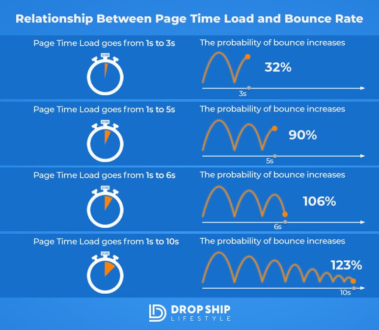
If your site loads longer than 3 seconds, potential conversion rates are hindered. You want your site to load fast no matter where the visitor is or how bad their connection is. You can check your current speed using a free tool from Google called PageSpeed insights. Just paste your URL there and it will give you a score and reasons why your site is slowing down.
If your store is on Shopify, like what we always recommend, there’s less to worry about. Shopify is an extremely fast hosting service. Your site would only be slow for some possible reasons like too many installed Shopify apps, using a slow site theme, or having poorly coded apps.
Still, to improve your site speed, here are some ways you can try:
2. Have a Sticky Header Bar
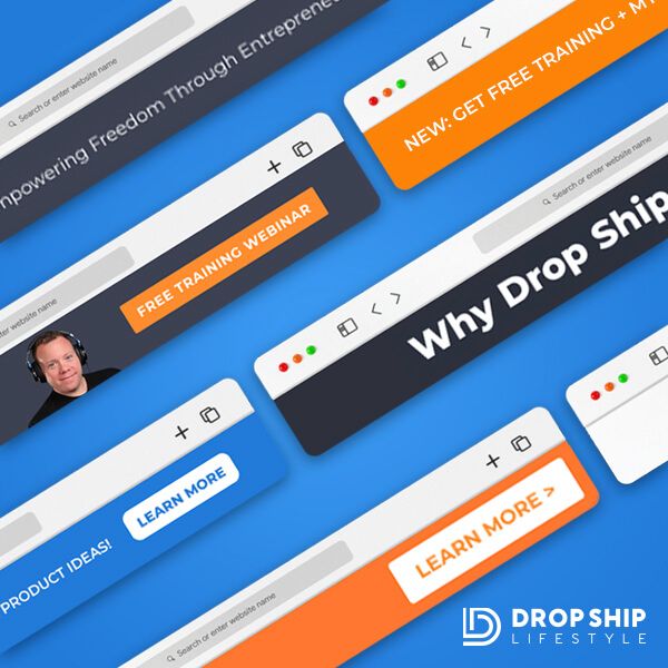
A sticky header, or a fixed header or menu, is a static navigation bar that remains visible and in its place as a site visitor scrolls through a page. It’s always accessible so visitors can easily navigate the site quickly.
You can observe this on our Drop Ship Lifestyle website. We like to use this because we want to display a message to our visitors and we want them to see it no matter which product page they’re on. We usually put offers that have expiration dates, like a 10% off coupon code with a message of something like “Save 10% on all orders with __ coupon code.” Having an expiration date is also important to give a sense of urgency to the visitors.
With messages like this and an easy-to-use and access header bar, visitors will be encouraged to easily check more content and make purchases.
3. Have a Small and Clean Logo
You may notice that some of the biggest companies in the world such as Apple, Nike, or Chanel have plain, simple, and tiny logos. This is because in reality, your visitors really don’t care about your logo and it doesn’t encourage them in any way to make a purchase decision.
As someone who has built and seen tons of stores, I’ve seen many stores and websites that have these huge circle logos with their taglines on the product pages. What the store names and images do is just attract visitors and draw their attention to them for no reason. They also push down everything else on the product page. With the important stuff placed much lower on a page, the attention of the visitors is lost.
This is why it’s essential to make your logo simple, clean, and small so it wouldn’t distract your visitors. Make sure that it won’t move the important content down the page as well so you’ll have higher chances of high conversion rates.
4. Include a Phone Number
Add a phone number to your pages. Depending on your preferences, your theme, and how your store is laid out, you can choose to put it on the header, footer, or somewhere else. In DSL, we always recommend putting phone numbers up on the header so that when there’s a visitor, they see it upfront. Nothing huge, but it’s there.
Although you’ll rarely get calls, the existing phone number can help build confidence, especially since we don’t have huge and popular brand names. Your website visitors may have doubts about whether they can trust your business. Having your phone number readily available can provide them with reassurance that they can contact you if they need to, particularly when they are making purchase decisions.
5. Simplify the Navigation Menu
Another thing I see all the time in many stores is that they like to put distracting links on the navigation bar. For example, links to their Facebook or Instagram page, Twitter account, or YouTube channel.
Keep in mind that you should consider your visitors as people who are about to buy so there would be no reason to have a link in your header telling them to check your Facebook. You want to improve conversion rates and make them buy.
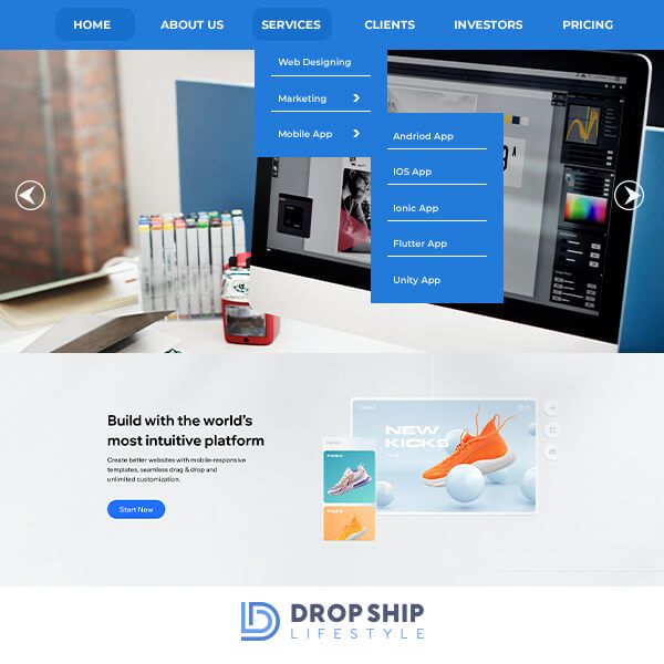
What I recommend is to use “nested menus” and keep them as simple as possible so the things you want to show off can be easily seen. For example, add a link that says “shop” that, when clicked, would direct the visitor to go to all your collections, but when hovered over, would show all of the different collections in your store. This is what I mean by nested – everything isn’t shown until a user hovers over it.
Remember that you don’t want about 50 links across the screen. They won’t help people make a purchase decision. Determine what’s important for your visitors and decide on what can encourage and lead them to buy then put those links in your menu.
6. Optimize Product Images
As sellers, you have to make sure that your customers can actually see what they’ll buy. They would want to be confident that what they’re looking at is the right thing for them before they give you their money.
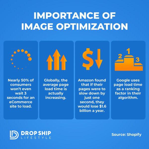
One way to do this is to optimize your product images. Here are some tips you can perform to do that:
7. Use Strikethrough Pricing
You’ve probably seen this strategy in most eCommerce stores. There is the actual price of the product and then there is a strikethrough price on the side. This creates a perception that the buyer can purchase the product for a lesser price since you’re crossing out the original price and gives a good feeling to your visitors and customers.
When you get approved by your suppliers, they will give you a manufacturer’s suggested retail price (MSRP) and a minimum advertised price (MAP). You want to use the MSRP as the strikethrough price and the MAP as the actual price you’re gonna sell the product for.
8. Sell Well Where Stock Is Limited
You should only do this on your products that sell well and have limited stocks as well. Add and indicate on the product pages how many units are left in stock. If there are only four left of your best-selling products, you should show them on that product page.
This will add to the extra scarcity of the product and will convince visitors to buy the product sooner than later because there are only a few stocks left.
9. Optimize the ‘Add to Cart’ Button
One common aspect of add-to-cart buttons on most sites is that they’re in some light shade of gray color, making it hard for visitors and customers to even see the button itself. That’s why you have to make sure that it’s in a color that will contrast its background color and even in the right font.
It should stand out on the page and can be seen even if the person is far away from the screen. You have to make sure that it’s extremely visible so it can draw attention and lead to conversion.
10. Show Off Your Estimated Arrival Date
One of the first things that people think about before they finish the ordering process is how long it will take or when the product is actually going to arrive at their house. That’s why it’s important to show off the estimated arrival dates of the products.
If you have these estimates based on your suppliers, you can use a custom code that will allow your visitors to see in real-time an estimated window of when the product will arrive at their home. This way, they won’t have to ask you and they don’t have to worry about when they’ll get it.
We can give you this code in our DSL training program so if you’re a member, you can go check that out. If you’re not a member, you can join our dropship webinar instead.
With this knowledge, visitors and customers are more likely to add to their carts and complete a purchase. A good way to improve conversion rates is eCommerce style.
11. Customer Reviews
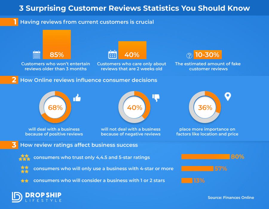
About 61% of eCommerce consumers read online reviews first before deciding on whether they’ll purchase the product. Reviews are known to convert and drive sales and can greatly influence a customer’s decision to purchase.
When you’re building your product pages, you want to show off star reviews with 1-5 stars and a message about what they liked and didn’t like about the product they got. But since it’s likely that you don’t have any sales yet in the beginning, you need to kind of get the ball rolling and kick this off.
Positive reviews play a big role in improving conversion rates so it’s crucial to place many of them on your products. What you can do is reach out to your suppliers and ask if they have any existing reviews that you can use on your store and product pages. If they have and give you, add those to the relevant product pages.
As sales start coming in, you can continue getting reviews with follow-up sequences via email. Ask for your past customers to rate their purchase, experience, and the product itself. We can provide email templates for this inside DSL so you can check that out.
12. Tabbed Descriptions
What I mean by this is after somebody gets to your store and sees the prices, the add-to-cart button, the remaining stocks left, and the estimated arrival date, instead of just hitting them with a wall of text of all this information in your product description, you can use tabs. This way, people can get all the information they need on the product page without leaving, which can help improve conversion rates.
The first tab will be the actual product description where you’ll include a modified version of the stock description your supplier sent to you. Make sure to rewrite it and turn the features into benefits in a way that will lead to sales again.
For the next tab, focus on the shipping aspect. Include your shipping policy like how soon orders ship out and how returns work, in case anybody wants to return it. Again, this prevents the potential buyer from going to a separate page on your site to check for this information. This helps them make purchase decisions faster.
The next tab I recommend is for your price match policy, if you have one. Add it there so they can easily see it and feel confident. Lastly, if you have a warranty or if your supplier offers a warranty, add tabs for that specific brand too.
13. Incorporating Bonus Offers
Determine what your best-seller products are and figure out a way to bundle in free bonus gifts. This will incentivize more people to buy from you and will improve conversion rates.
For example, if you’re selling a 3D printer for $2,500, figure out how much the printing material costs, which let’s say is $50. For this example, you can offer a bonus on your product page something like “when you buy an XYZ printer from us, you also get this free spool of printing material that costs about $150 or whatever the value is.“
14. Incorporating Product Q&As
You can think of this as a discussion board about the product on the product pages. These Q&As will allow customers to actually see a box that says QA and if they have a question related to the product, they can ask that there. You’ll get notified of this as the site owner and answer that question.
The question and your answer will then go live on the product page and it can build over time. As time passes, you’ll get more questions and you can answer more which will help future visitors that might have the same questions by having the answers easily accessible on that page.
This can also build up your organic traffic, especially because these Q&As can be unique content: unique questions and unique answers. These can help Google put your store higher on the list which is a good way how to improve conversion rates.
Avoid having a blank Q&A section by thinking about what customers might want to know about the product. Ask yourself and answer yourself as well. You can also check your emails and see what they’ve been asking via email and go to your product page’s Q&A section and ask those questions so that they appear live.
15. Use Live Chat
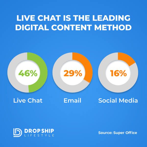
You’re probably familiar with the little live chat button at the bottom of a product page which visitors can click if they have a question or issue. They can use this live chat to ask questions in real-time and get answers in real-time, increasing the chances of converting a visitor into a customer.
One of the DSL community members actually shared with us how this contributed and helped improve conversion rates in eCommerce style. They mentioned that they were watching TV when they got a live chat notification on their phone, which she responded to and closed a $24,000 sale.
This shows that it’s worth it. If there was no live chat on the pages, the visitor might have gone to the next website and placed that huge order with someone else.
Improve Conversion Rates - Conclusion
Product pages are the heart of an eCommerce website. They’re what largely convince visitors to buy and generate sales. You can have the best checkout process or Facebook ads but without optimizing your product pages, your visitors’ carts will most likely stay empty. That’s why it’s normal that you should optimize your product pages so you can improve conversion rates and revenue.
Don’t forget to follow the tips we listed above to get higher conversion rates for your store. With high conversion rates, you’ll also be getting many sales and revenue from your business.


Hey Everyone,
As many of you already know I created Drop Ship Lifestyle after selling a network of eCommerce stores and then trying to find a community of other store owners to network with… What I found was a bunch of scammers who promised newbies they would get rich quick by following their push-button systems!
This led me to create a new community along with an online training program that shares how to build a REAL online business.
I’d love to hear what you think… it’s a 2.5-hour training designed to help you drop ship profitably… all for free.
Be sure to click here to check it out and send me your feedback!
If you go through the “How To Start & Grow A Hyper-Profitable Online Store” webinar and still have questions just contact me and I will help you out